Showing posts with label Predators. Show all posts

January 24, 2024

Predators Foursome

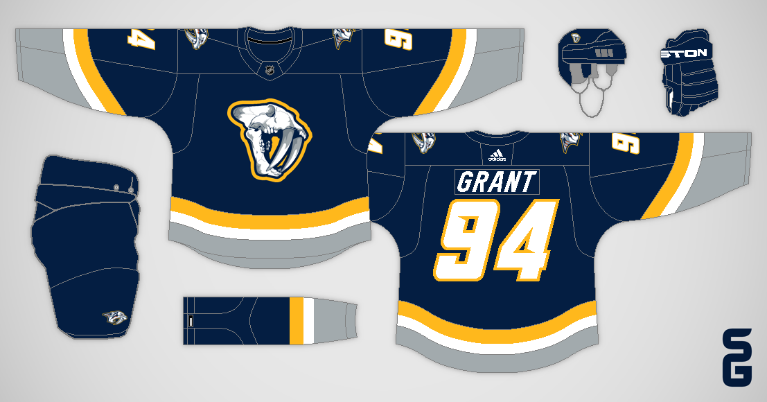
Nashville Predators
I chose to use the Predators' Winter Classic logo for the primary set, while I paired their old skull logo with a double grey and gold colour scheme for the alternates.

I'll be back soon!

May 09, 2023

Nashville Predators - NHL Sock Series

Hello once again!

Nashville Predators
Here I used the Predators original navy socks and number font, and their alternate skull logo from that era. The arm stripes are curved to match their current jerseys.

As a reminder here's how this series works, each concept reuses a sock design the team has worn at some point in their history. My challenge is to make something new that still matches those socks.

The Devils are the next team up, and they were a bit of a challenge!

January 03, 2022

NHL Double Series - Suggested Revisions

Hello!  Today's post (the penultimate of my NHL Double Series) features revisions suggested from viewers like you.  Most of the suggestions come from CCSLC (Chris Creamer's Sports Logos Community, also known as the SportsLogos.Net forums).

My Ideal Arizona Coyotes (Revision #1)
CCSLC user B-mer suggested I add a black line above the Kachina pattern on the road jersey of my "Ideal" Coyotes concept.

My Ideal Arizona Coyotes (Revision #2)
Then CCSLC user vtgco recommended I surround the Kachina pattern in black on the home jersey as well.


New Look Buffalo Sabres
Here I added more stripes to the hem of my New Look Sabres concept (as suggested by CCSLC user ldconcepts), and ditched the Buffaslug shoulder logos (suggested by both ldconcepts and CCSLC user hockey week).


New Look Calgary Flames
On my New Look Flames set I flipped the red and maroon stripes to create a sorta gradient design, as requested by vtgco.


My Ideal Columbus Blue Jackets
The colours on the hem of my "Ideal" Blue Jackets road jersey were swapped to be mostly navy, suggested by vtgco.


New Look Columbus Blue Jackets
This revision of my New Look Blue Jackets set replaces Stinger with the cannon logo, again suggested by vtgco.


New Look Detroit Red Wings
Changes to this New Look Wings concept include; ditching the pant stripe, recolouring the pant logo red, removing the white stripe at the top of the home jerseys' sleeves, and going with a leather coloured helmet.  All changes suggested by vtgco.


New Look Florida Panthers
B-mer recommended I use the Panthers current numbers on my New Look Panthers concept.


My Ideal Nashville Predators
B-mer also thought I should try a yellow yoke on the road jersey of my "Ideal" Predators set.


New Look New York Islanders (Revision #1)
CCSLC user DTConcepts suggested I add the Islanders four-stripe motif to the arms here on the New Look concept, and remove them from the back numbers.

New Look New York Islanders (Revision #2)
B-mer then added a request for a version of the concept with plain arm and sock stripes.


New Look New York Rangers (Revision #1)
DTConcepts suggested I add seafoam green to the striping pattern of my New Look Rangers design.

New Look New York Rangers (Revision #2)
Later on vtgco proposed I connect the cuffs to the arm stripes on the road jersey.


New Look Seattle Kraken
Another vtgco suggestion was to thicken the hem stripes and lower the logo of my New Look Kraken concept.


My Ideal Winnipeg Jets
In a comment here on the blog, Chase A. Carlson recommended I add more navy to the road jersey of my "Ideal" Jets set.


New Look Winnipeg Jets
Lastly back on CCSLC, TheRealPepman proposed I use white for the home jersey's name and numbers on my New Look Jets set.


Thanks for stopping by, and thank you to everyone for all the comments and suggestions throughout this series!  The next post will be the finale of this series.

May 27, 2020

Hockey & Space

Welcome back folks!  Here's a quick space themed post!

Team SpaceX:
This SpaceX concept is based off of the launch suits worn by astronauts in the SpaceX Crew Dragon spacecraft.

Team NASA:
I made a NASA concept a few years ago, this is the same concept just on a different template.  The design is inspired by NASA's white spacesuits and blue flight-suits.

AstroRad Vest:
Image from nasa.gov
Moving on, you'll notice the Tampa Bay Lightning's logo on the AstroRad Vest in the above photo (taken inside the cupola of the International Space Station).  The context is that the Lightning's owner Jeff Vinik invested in the company that made the AstroRad Vest.

Nashville Predators Jersey in Space:
Last but not least, here's a video from 2014 in which NASA astronaut Barry Wilmore was wearing a Nashville Predators during his stay up at the International Space Station (ISS)!

Later this afternoon (at 4:33 pm EDT), NASA and SpaceX will be launching astronauts Bob Behnken and Doug Hurley up to the ISS (if the weather cooperates, if not there are back up dates on the 30th and 31st).  The coverage has already begun, so go check that out!

July 14, 2019

Double Predators

Howdy folks!

My Ideal Nashville Predators:
The Predators made a great decision back in 2011 when they updated their logos and switched to yellow as their primary colour.  However, I also loved how unique the striping pattern of their original jerseys were, so I tried to bring a bit of that back with this concept (I made a similar concept back in 2013).

New Look Nashville Predators:
My idea with this concept was to place the sleeve numbers in a guitar pick shape, and place those over top of the stripes.

Have a nice day!

July 22, 2017

Simple Predators

Hello there, here's another concept!

Nashville Predators:
The Nashville Predators simplified their jerseys with the switch to Adidas, but they went too far and now their jerseys are bland.  This concept is my attempt at keeping the simplicity of their new jerseys, while avoiding the blandness.

So long!