Occasionally people will make negative comments about my concepts, but that doesn't bother me for two reasons. First of all, the positive comments vastly outnumber the negative comments. Most importantly though, I take the negative comments as a good sign that I'm being daring enough with my concepts.
So today I thought I'd take a look at some of the negative comments left by
Icethetics users, and the concepts of mine that inspired those strong opinions.
This was the first time I was featured as the daily concept on Icethetics. My main goal here was to try out a dark purple and silver colour scheme, and most of the comments were positive. However, Ron Swanson was not a fan, presumably due to the use of purple. I wonder if Ron knows the Kings used purple as their primary colour for their first 20 years of existence.
thats basically a long sleeved soccer shirt, not a hockey jersey, sorry not a fan.....
- JerseyMan
JerseyMan summed this concept up perfectly, this is basically just a long sleeve soccer shirt. That wasn't my intention when I made this concept though, it was supposed to be a modern take on the Canucks' Flying-V jerseys.
sorry but i absolutely hate those little teepees.
- Bickleton Wigglesworth III
Teepees! TEEPEES!!! Why would they be little teepees, they're obviously the sun rays from the Panthers old secondary logo (it would probably make more sense if the striping was curved instead of straight). I was attempting to give the Panthers their own unique pattern, like the Hurricanes' warning stripes or the Coyotes' kachina design.
No. Just. No. How dare you.
- Dynamic Threads
Sometimes it's too easy to get a reaction out of people, all you have to do is use the Sabres' buffaslug logo and people will completely freak out. Although, I actually think that logo would have been better received if it was only ever used as a shoulder patch.
This is somehow worse than their current set.
- Dynamic Threads
What an asinine comment, there is NO WAY these are worse than Colorado's primary set in 2016. Those Avalanche jerseys were some of the worst primary jerseys in the history of the NHL, with their ugly side panels, piping, and shoulder yokes that desperately needed some trim. This isn't a very good concept, but it's better than those abominations.
Nope
- David Lindquist
Counterpoint, Yes!
In all seriousness, this concept wasn't meant to be taken too seriously, it was featured as a Freak-out-Friday on Icethetics after all. But it was a very enjoyable concept to make!
Oh god no
- TheNosilboogith
This was my take on the Leafs "Next Gen" alternate jersey, and I didn't think it was that crazy of a concept. The only daring feature was the bright blue, but I guess that was enough to startle some people.
I like a lot of Steven’s designs, this isn’t one of them. These just feel wrong.
- Chad Walsh
I actually meant for this concept to be a bit disappointing, at least the home and road jerseys. You see, back in 2012 when I did my first
Nordiques What If? series, I ended the series on a high note by returning them to their classic jerseys.
Part two of the series in 2022 needed a different ending, so I ditched those classic jerseys for a modern "stealth" set.
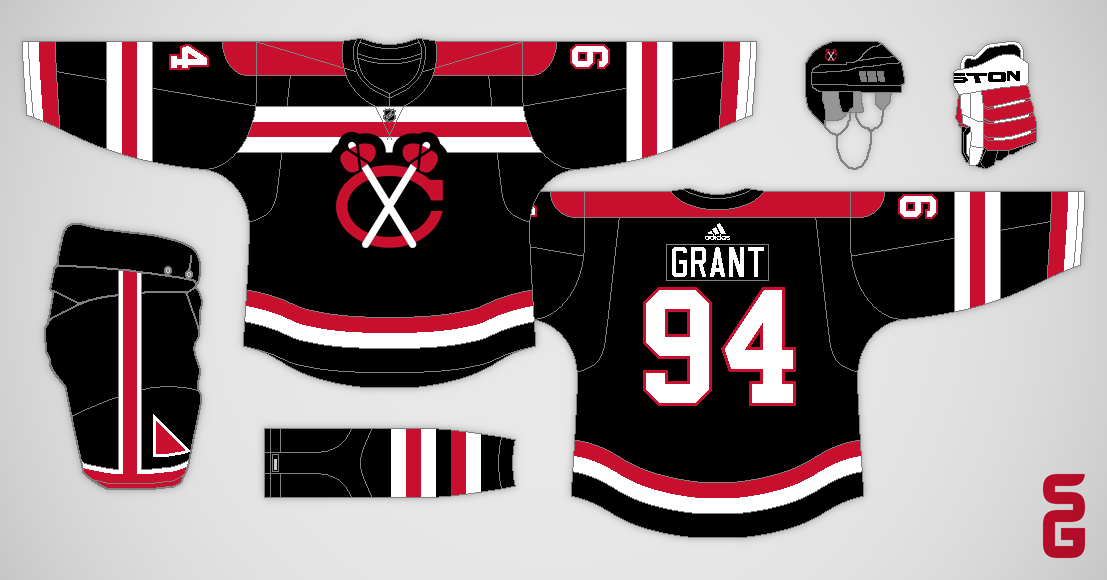
this is blasphemous! Awful.
- TheConsiglierre
Many people believe the Blackhawks have the best jerseys in the NHL, and some of those people get quite upset if you try to experiment with their look. That makes them a very fun team to make concepts for. For the above concept I made the "blasphemous" decision to add the colours from their logo to the striping.
Thanks for stopping by, and feel free to add your own comment (either positive or negative).
P.S. Don't take this post too seriously, I'm mostly just goofing around.