December 31, 2023

Wild Foursome

Minnesota Wild
Should the Wild keep their current colour scheme, or ditch it for the North Stars' green and gold? I think they should keep using both.

See you next year!

December 27, 2023

Lightning Foursome

Tampa Bay Lightning
I brought back the Lightning's original "Hawaiian Blue" for the home and road set of this concept, while the alternates use the black and silver colour scheme from their most recent third jersey.

Thanks for visiting!

December 25, 2023

Blackhawks Foursome

Chicago Blackhawks
The primary jerseys in this concept are a twist on the Blackhawks current set, while the alternates use a black and vintage white colour scheme.

Merry Christmas!

December 22, 2023

Sabres Foursome

Buffalo Sabres
This is my attempt to combine the Sabres two identities into a more cohesive set.

Also, I thought I'd explain the rules I've been following for this mini-series of concepts:
  • All jerseys must use the same striping pattern and number font (# of outlines can vary).
  • Each jersey must be a different colour.
  • White isn't mandatory as the base for the road jerseys (any light colour is allowed).
  • The primary set and alternate set must use different colour schemes.
  • The primary set and alternate set must use different logos.

I'll be back soon!

December 20, 2023

Bruins Foursome

Boston Bruins
This Bruins concept uses their regular colours for the home and road set, and vintage colours for the third and fourth jerseys.

Happy Holidays!

December 16, 2023

Kings Foursome

Los Angeles Kings
Black and silver or purple and gold for the Kings? How about both?

Good night!

December 13, 2023

Penguins Foursome

Pittsburgh Penguins
The Penguins wore double blue for their first 13 years, before switching to black and gold in 1980. This concept uses both colour schemes, and only uses white in the logos.

Have a nice day!

December 09, 2023

Canucks Foursome

Vancouver Canucks
Here's a set of four concepts for the Canucks using the design of their current third jersey (including the yellow concept from my last post).

That's all!

November 25, 2023

Yellow Canucks and Secret Template 2.0

Vancouver Canucks
The Canucks current third jersey is quite popular among their fans, which has some people wondering if it will eventually become their next home jersey. If it does, I think they should go with a yellow road jersey (yellow was their light jersey colour from 1978-89). Nashville's yellow home jersey could cause some logistical problems, but the Canucks could just wear their black jerseys for those games.

Also I made some updates to my new "secret" template, fixing some issues with the sleeves and hem.

Thanks for visiting!

October 27, 2023

Flyers, Halloween, and a Secret Template

Happy Halloween (in a few days)!

Philadelphia Flyers
What better way to celebrate Halloween (a few days early) than with a Flyers concept! They got new home and road jerseys this year but kept their existing third jersey. This is my take on what an updated third jersey could look like.

If you look closely you might notice I used a new template for the above concept. This new template will eventually replace my "Combo" template when Fanatics takes over next year (with any necessary modifications of course). In the meantime it should be considered a work in progress, as I may make changes if I discover any issues. Here's the link to the new template.

Enjoy your weekend!

October 14, 2023

I've Been Using the Bruins "Centennial" Logo for the Last 12 Years

As you all know, the Boston Bruins introduced a new primary logo for their centennial season. It's a combination of their modern (2007-23) and traditional (1949-95) spoked-B logos. I think the new logo is great, in fact I have thought it would make a great logo for a long time, as I've already been using it on my concepts for the last 12 years.  Here's proof...

Boston Bruins (from October 19th, 2011)
I first used the logo on the above concept from October 2011.  I also made concepts using this logo in June of 2012June of 2013January of 2014, and November of 2017.

As for the Bruins new jerseys, I love the third jersey but I'm not a fan of the home and road set. The metallic gold doesn't look good from a distance, and there needs to be more yellow/gold anyways (yoke, numbers, and/or socks). However, the jerseys are only around for a year so I can tolerate them for now.

But what should the Bruins do next year? I hope they keep their new logo, I think it's vastly superior to its predecessor. They could just put the new logo on their previous template, but I actually think the template of their new third jersey provides an even better opportunity.

Boston Bruins (2024-25?)
As I mentioned, I love the Bruins new third jersey. I think they should use its design as the basis of their next primary jerseys. All they have to do is ditch the vintage colours (off-white and brown), and use the standard versions of their new logo.

Thoughts?

October 04, 2023

Hey Now, You're an All-Star

I don't make All-Star Game concepts very often, in fact I believe it's only happened once before way back in 2012. That concept was before the 3-on-3 tournament existed, so it only had two jerseys. This concept has four jerseys, one for each division.

2024 NHL All-Star Game
The first official NHL All-Star game was held in Toronto in 1947, and the design of those jerseys would last for over a decade. This concept is very loosely a modern version of those original jerseys. The Atlantic jersey is blue (with bright blue accents) since the game is in Toronto, with the Metropolitan division getting a matching white jersey. The red and yellow for the Pacific and Central divisions come from the All-Star game logo. I only wanted to use two sets of equipment, so I chose bright blue for the Eastern divisions.

Have a nice day!

September 12, 2023

Reacting to Negative Comments

Occasionally people will make negative comments about my concepts, but that doesn't bother me for two reasons. First of all, the positive comments vastly outnumber the negative comments. Most importantly though, I take the negative comments as a good sign that I'm being daring enough with my concepts.

So today I thought I'd take a look at some of the negative comments left by Icethetics users, and the concepts of mine that inspired those strong opinions.


King of All Kings Concepts (April 9th, 2012)
Looks like one of those female versions of jerseys that you can get in the official team stores. I hate it. This coming from a die-hard Kings fan.
- Ron Swanson
This was the first time I was featured as the daily concept on Icethetics. My main goal here was to try out a dark purple and silver colour scheme, and most of the comments were positive. However, Ron Swanson was not a fan, presumably due to the use of purple. I wonder if Ron knows the Kings used purple as their primary colour for their first 20 years of existence.


thats basically a long sleeved soccer shirt, not a hockey jersey, sorry not a fan.....
- JerseyMan
JerseyMan summed this concept up perfectly, this is basically just a long sleeve soccer shirt. That wasn't my intention when I made this concept though, it was supposed to be a modern take on the Canucks' Flying-V jerseys.


sorry but i absolutely hate those little teepees.
- Bickleton Wigglesworth III
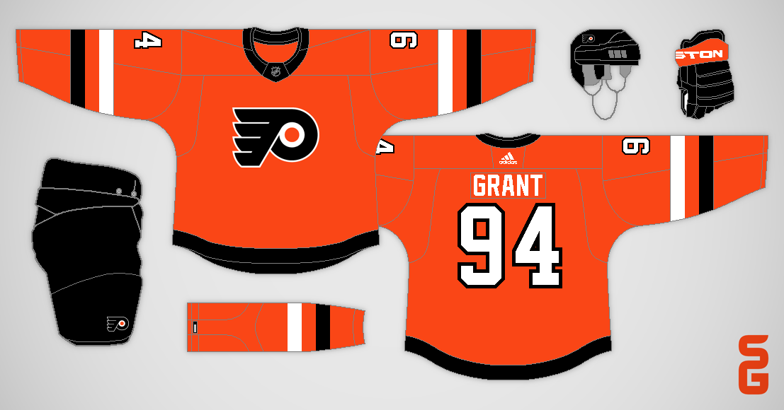
Teepees! TEEPEES!!! Why would they be little teepees, they're obviously the sun rays from the Panthers old secondary logo (it would probably make more sense if the striping was curved instead of straight). I was attempting to give the Panthers their own unique pattern, like the Hurricanes' warning stripes or the Coyotes' kachina design.


No. Just. No. How dare you.
- Dynamic Threads
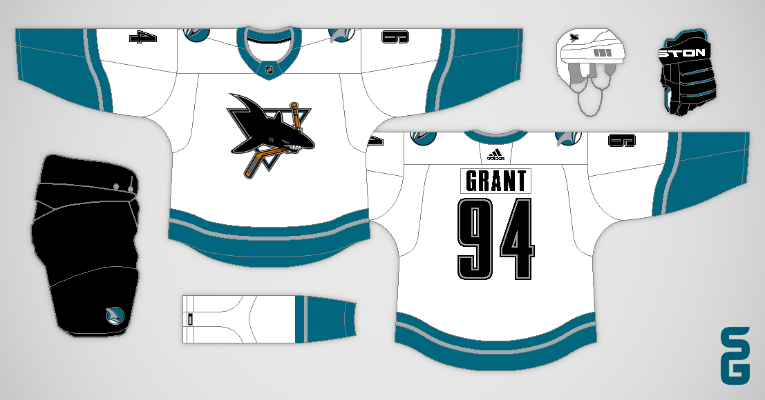
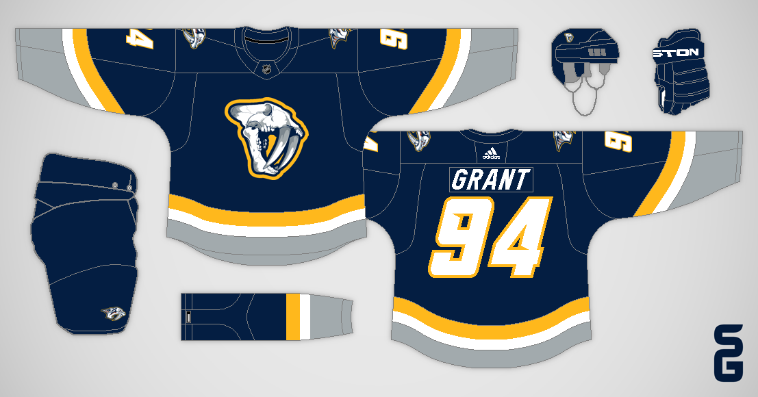
Sometimes it's too easy to get a reaction out of people, all you have to do is use the Sabres' buffaslug logo and people will completely freak out. Although, I actually think that logo would have been better received if it was only ever used as a shoulder patch.


This is somehow worse than their current set.
- Dynamic Threads
What an asinine comment, there is NO WAY these are worse than Colorado's primary set in 2016. Those Avalanche jerseys were some of the worst primary jerseys in the history of the NHL, with their ugly side panels, piping, and shoulder yokes that desperately needed some trim. This isn't a very good concept, but it's better than those abominations.


Nope
- David Lindquist
Counterpoint, Yes!

In all seriousness, this concept wasn't meant to be taken too seriously, it was featured as a Freak-out-Friday on Icethetics after all. But it was a very enjoyable concept to make!


Oh god no
- TheNosilboogith
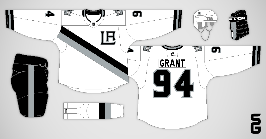
This was my take on the Leafs "Next Gen" alternate jersey, and I didn't think it was that crazy of a concept. The only daring feature was the bright blue, but I guess that was enough to startle some people.


I like a lot of Steven’s designs, this isn’t one of them. These just feel wrong.
- Chad Walsh
I actually meant for this concept to be a bit disappointing, at least the home and road jerseys. You see, back in 2012 when I did my first Nordiques What If? series, I ended the series on a high note by returning them to their classic jerseys. Part two of the series in 2022 needed a different ending, so I ditched those classic jerseys for a modern "stealth" set.


this is blasphemous! Awful.
- TheConsiglierre
Many people believe the Blackhawks have the best jerseys in the NHL, and some of those people get quite upset if you try to experiment with their look. That makes them a very fun team to make concepts for. For the above concept I made the "blasphemous" decision to add the colours from their logo to the striping.


Thanks for stopping by, and feel free to add your own comment (either positive or negative).

P.S. Don't take this post too seriously, I'm mostly just goofing around.

August 22, 2023

Coyotes Half-and-Half

Arizona Coyotes
This Coyotes half-and-half concept uses their sienna, brick red, and sand colours.

Enjoy the rest of your day!

July 21, 2023

Kraken Concept with Waves

Seattle Kraken
I used this wave pattern on the sleeves of a previous Kraken concept, now I wanted to see how it would look being used throughout the whole jersey.

Enjoy the weekend!

July 16, 2023

Hurricanes Half-and-Half

Carolina Hurricanes
Here's a Hurricanes half-and-half concept, using a double warning-flag stripe across the chest.

That's all for now!

July 11, 2023

Senators Half-and-Half

Ottawa Senators
Should the Senators home jersey be black or red? Why not both?

See you later!

July 08, 2023

Victory Stripes

Tampa Bay Lightning
This concept uses the pattern from the Lightning's old victory stripes as a chest/sleeve stripe.

Thanks for visiting!

July 05, 2023

Canucks Half-and-Half

Vancouver Canucks
Here's another half-and-half concept, this one uses the stripes from the Canucks original white jersey (including the V in the sleeve stripes).

Have a nice day!

June 30, 2023

Kraken Half-and-Half

Seattle Kraken
Here are a couple of half-and-half concepts for the Kraken, using the hem stripe design from their current road jersey as the chest stripe.

Enjoy the weekend!

June 19, 2023

Penguins Half-and-Half

Pittsburgh Penguins
The sleeves of the Penguins' current jerseys are half black and half yellow, which gave me the idea for this half-and-half concept. I also included a matching road jersey.

Thanks for stopping by!

May 24, 2023

Winnipeg Jets - NHL Sock Series

Welcome back for one final concept in my NHL Sock Series!

Winnipeg Jets
For Winnipeg I went with their road socks, but I ditched the navy blue from the rest of the uniform. The stripes are angled to match the wordmark logo, and the numbers are angled to match the stripes.

As a reminder here's how this series worked, each concept reused a sock design the team had worn at some point in their history. My challenge was to make something new that still matched those socks.

That's the end of this series! Thanks for following along, I had a lot of fun making these concepts!

May 23, 2023

Washington Capitals - NHL Sock Series

Hello, we've almost reached the end of this series!

Washington Capitals
There have been many concepts over the years which use the Capitals' Weagle logo on a navy blue jersey. This one reuses the home socks they wore after the switch to Reebok Edge jerseys in 2007.

As a reminder here's how this series works, each concept reuses a sock design the team has worn at some point in their history. My challenge is to make something new that still matches those socks.

Tomorrow this series ends with a Jets concept!

May 22, 2023

Vegas Golden Knights - NHL Sock Series

Hi again!

Vegas Golden Knights
I didn't have many options for the Golden Knights, so I went with a traditional design using their Reverse Retro 1.0 socks.

As a reminder here's how this series works, each concept reuses a sock design the team has worn at some point in their history. My challenge is to make something new that still matches those socks.

Tomorrow we head to Washington D.C. for the penultimate concept of this series!

May 21, 2023

Vancouver Canucks - NHL Sock Series

Hello folks!

Vancouver Canucks
This Canucks concept combines the colour scheme (and sock design) from their original orca jerseys, with the V on the sleeve stripes from their inaugural jerseys, and their current stick-in-the-rink logo and number font.

As a reminder here's how this series works, each concept reuses a sock design the team has worn at some point in their history. My challenge is to make something new that still matches those socks.

The Golden Knights are coming up next!

May 20, 2023

Toronto Maple Leafs - NHL Sock Series

Hello and welcome back!

Toronto Maple Leafs
For the Maple Leafs I chose the socks they wore during the late 1920's. The logo is the earliest version of their leaf logo.

As a reminder here's how this series works, each concept reuses a sock design the team has worn at some point in their history. My challenge is to make something new that still matches those socks.

Next up is a return to the West-Coast-Express-era for the Vancouver Canucks!

May 19, 2023

Tampa Bay Lightning - NHL Sock Series

Welcome everybody!

Tampa Bay Lightning
I went with a wordmark within a chest stripe for the Lightning, using the socks from their Reverse Retro 1.0 jersey.

As a reminder here's how this series works, each concept reuses a sock design the team has worn at some point in their history. My challenge is to make something new that still matches those socks.

Toronto is up next, and I went all the way back to the 1920's for them!

May 18, 2023

Seattle Kraken - NHL Sock Series

How's it going?

Seattle Kraken
It seems like Kraken fans want to see the anchor logo on the front of a jersey someday, so that's what I did here. The striping pattern comes from the socks of their Reverse Retro jersey.

As a reminder here's how this series works, each concept reuses a sock design the team has worn at some point in their history. My challenge is to make something new that still matches those socks.

Tomorrow's team is Tampa Bay!

May 17, 2023

San Jose Sharks - NHL Sock Series

Hello fellow hockey fans!

San Jose Sharks
The Sharks' early 2000's white socks didn't feature any black, which I think works really well to represent the ocean. So I used that striping pattern on the jersey, and added a wave design to the sleeves.

As a reminder here's how this series works, each concept reuses a sock design the team has worn at some point in their history. My challenge is to make something new that still matches those socks.

The Kraken and their anchor logo are up next!

May 16, 2023

St. Louis Blues - NHL Sock Series

Welcome back!

St. Louis Blues
The striping pattern for this concept comes from the socks the Blues wore in the early 2000's. I also recoloured their trumpet logo and used it on the front of the jersey.

As a reminder here's how this series works, each concept reuses a sock design the team has worn at some point in their history. My challenge is to make something new that still matches those socks.

Up next is one of my favourite concepts of this series!

May 15, 2023

Pittsburgh Penguins - NHL Sock Series

Hello fellow humans!

Pittsburgh Penguins
This concept brings back the scarf-wearing Penguin logo, and the Penguins' old double blue colour scheme as well. The socks come from their mid 1970's uniforms.

As a reminder here's how this series works, each concept reuses a sock design the team has worn at some point in their history. My challenge is to make something new that still matches those socks.

The next concept in this series features a trumpet!

May 14, 2023

Philadelphia Flyers - NHL Sock Series

Hello and happy Mother's Day!!!

Philadelphia Flyers
After the Flyers ditched their Cooperalls, they wore this sock design for a single season.

As a reminder here's how this series works, each concept reuses a sock design the team has worn at some point in their history. My challenge is to make something new that still matches those socks.

Up next are the Penguins in their old double blue colour scheme!

May 13, 2023

Ottawa Senators - NHL Sock Series

Hello, bonjour!

Ottawa Senators
The last time an Ottawa Senators NHL team used a shield logo front and center was in the 1920's. The socks come from Ottawa's 2008-11 SENS alternate jersey.

As a reminder here's how this series works, each concept reuses a sock design the team has worn at some point in their history. My challenge is to make something new that still matches those socks.

The Flyers are the next team in line!

May 12, 2023

New York Rangers - NHL Sock Series

Hi folks!

New York Rangers
For the Rangers I chose the stripes from the socks they wore during their short lived redesign in the 70's. I also used a vintage version of their shield logo (slightly altered) as the main crest.

As a reminder here's how this series works, each concept reuses a sock design the team has worn at some point in their history. My challenge is to make something new that still matches those socks.

Tomorrow's Senators concept also features a shield as the primary logo!

May 11, 2023

New York Islanders - NHL Sock Series

Hello! I hope your day is going well so far!

New York Islanders
I chose to use the Islanders white fisherman socks for this concept, but I ditched all the wacky stuff from the jersey. I also placed the lighthouse logo on the front of the jersey.

As a reminder here's how this series works, each concept reuses a sock design the team has worn at some point in their history. My challenge is to make something new that still matches those socks.

The other New York team is up next!

May 10, 2023

New Jersey Devils - NHL Sock Series

Hello and happy Wednesday!

New Jersey Devils
The Devils were another challenging team for this series since all their socks have matched their jerseys. I ended up using their original red socks, but I put the stripes on the shoulders of the jersey. I also used the NJ from their unused prototype logo.

As a reminder here's how this series works, each concept reuses a sock design the team has worn at some point in their history. My challenge is to make something new that still matches those socks.

Tomorrow a lighthouse takes center stage!

May 09, 2023

Nashville Predators - NHL Sock Series

Hello once again!

Nashville Predators
Here I used the Predators original navy socks and number font, and their alternate skull logo from that era. The arm stripes are curved to match their current jerseys.

As a reminder here's how this series works, each concept reuses a sock design the team has worn at some point in their history. My challenge is to make something new that still matches those socks.

The Devils are the next team up, and they were a bit of a challenge!

May 08, 2023

Montreal Canadiens - NHL Sock Series

Bonjour!

Montreal Canadiens
For this concept I took the pattern from the Canadiens' white socks and used it as a chest stripe. I then went with red numbers to balance out all the blue.

As a reminder here's how this series works, each concept reuses a sock design the team has worn at some point in their history. My challenge is to make something new that still matches those socks.

A navy blue Nashville jersey is next!

May 07, 2023

Minnesota Wild - NHL Sock Series

Helloooo!

Minnesota Wild
This Wild concept brings back their unique number font, and pairs it with their original wordmark. The striping pattern comes from their inaugural green socks.

As a reminder here's how this series works, each concept reuses a sock design the team has worn at some point in their history. My challenge is to make something new that still matches those socks.

Montreal is up next!

May 06, 2023

Los Angeles Kings - NHL Sock Series

Hola!

Los Angeles Kings
I ended up going with a sash design for the Kings, possibly inspired by their Burger King jerseys. The socks used are from their current third jersey.

As a reminder here's how this series works, each concept reuses a sock design the team has worn at some point in their history. My challenge is to make something new that still matches those socks.

Tomorrow's concept is WILD, so stay tuned!