Hello folks, and welcome to a post ten years in the making! Back in 2012 I made a series of Quebec Nordiques concepts, a fictional timeline of what they might have looked like if they had never left. Those concepts became the
most viewed post on my previous blog SG-94 (by a wide margin). Today is the 10 year anniversary of that post, so I thought it would be a great time to add onto the timeline. We begin in 1995...
Pre-Edge Era
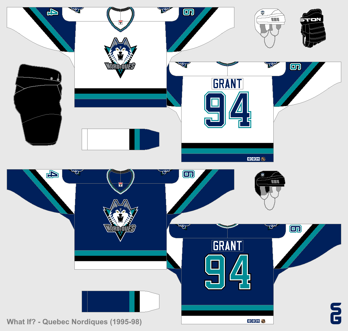
1995-98
In 1995 the Nordiques completely redesigned their uniforms. The colours changed, and a wolf (or husky?) became the primary logo. These jerseys weren't well liked by most fans, and as a result they only lasted three years.
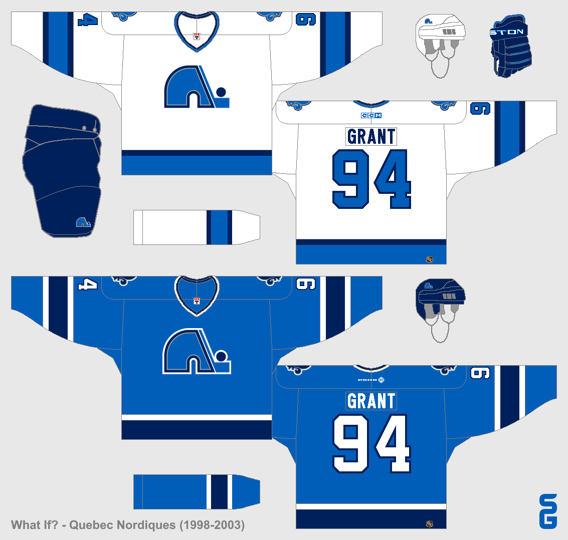
1998-2003
In the summer of 1998, the Nordiques announced that their unpopular "Wolf" jerseys were going away. Most fans were hoping for a return to the classic logo and jerseys. They did get the Igloo logo back, but the jerseys were new, with navy and silver added to the colour scheme. Many fans liked these jerseys, but some were disappointed that the classic jerseys weren't back.
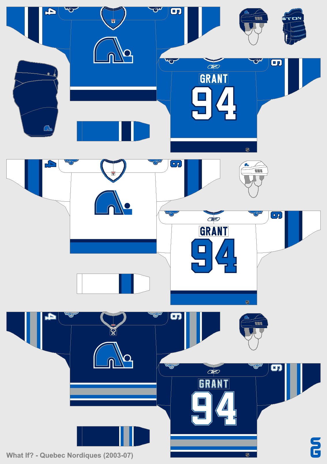
2003-07
The Nordiques added a third jersey in 2003, which would last until the switch to Reebok Edge jerseys in 2007. The jersey was navy blue with lots of silver.
Reebok Edge Era
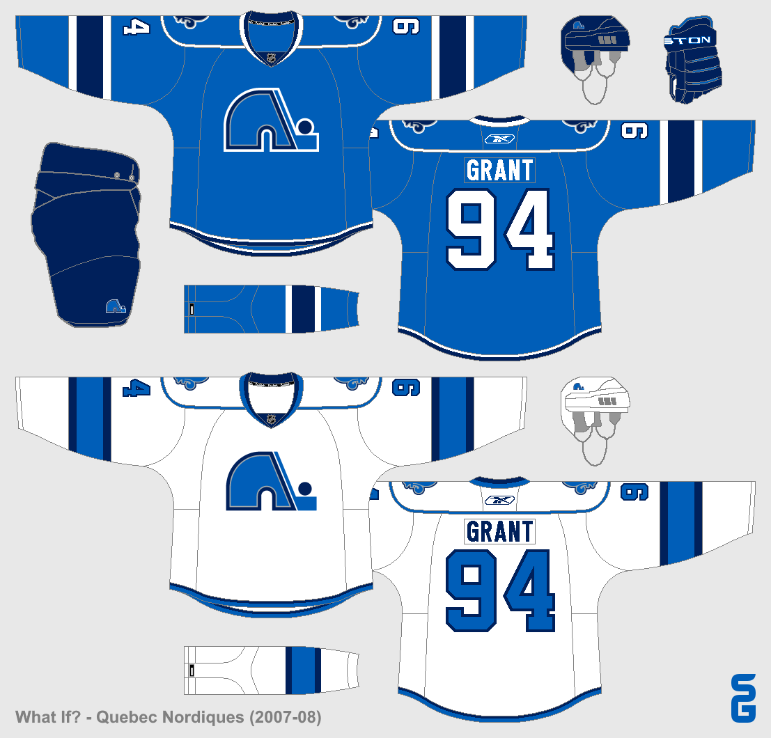
2007-08
Slight changes were made to the jerseys during the switch to the Reebok Edge cut. A phantom shoulder yoke was added, and the hem-stripes became smaller. These changes weren't well liked by fans, who still wanted to see a return to the classic set.
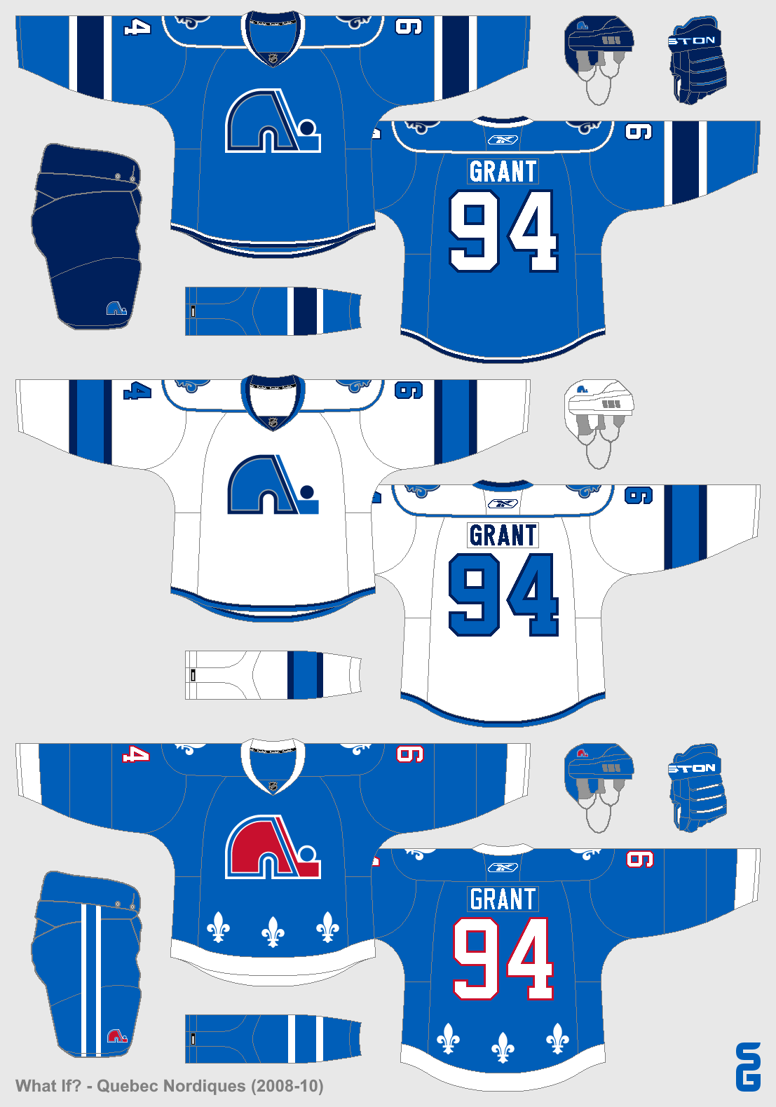
2008-10
When the third jersey program was re-introduced in 2008, the Nordiques finally listened to their fans by adding a throwback jersey based off of their classic blue jersey.
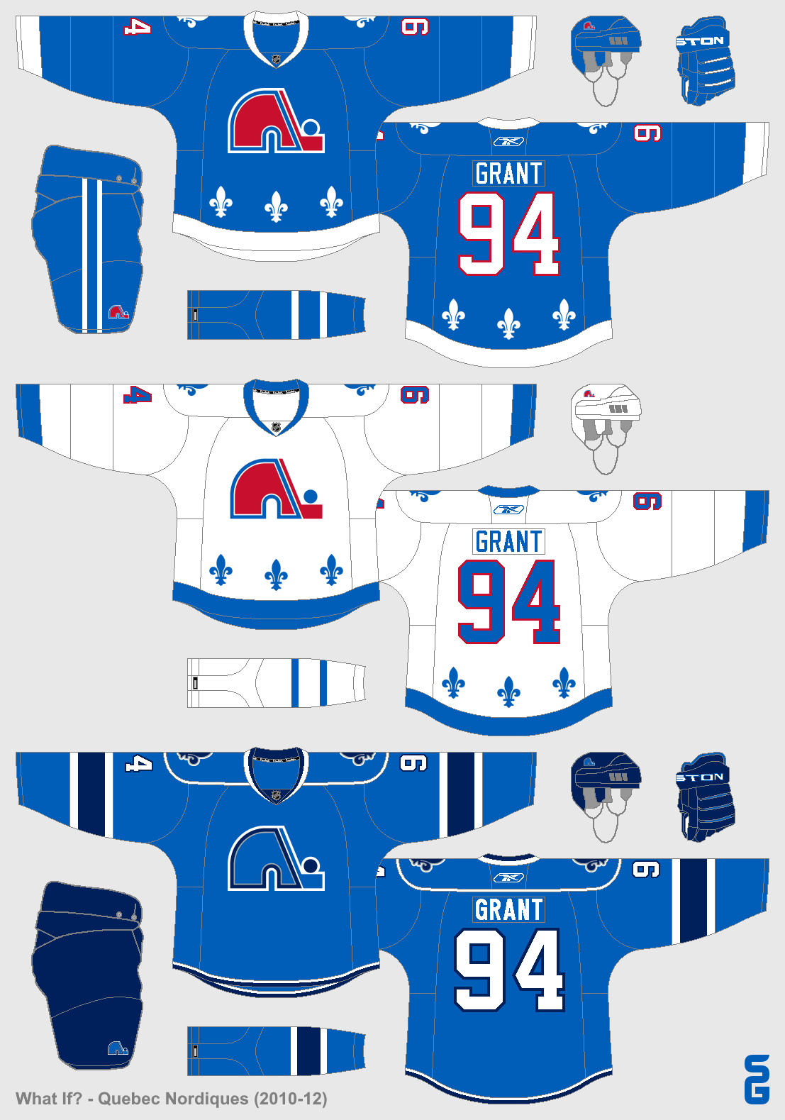
2010-12
The third jersey became the home jersey, and a matching away jersey was added. The previous home jersey stayed on as a third jersey.
2012-13
On June, 15th 2012, the Nordiques announced that they were scrapping their third jersey and would only have the two throwback jerseys for the next season.
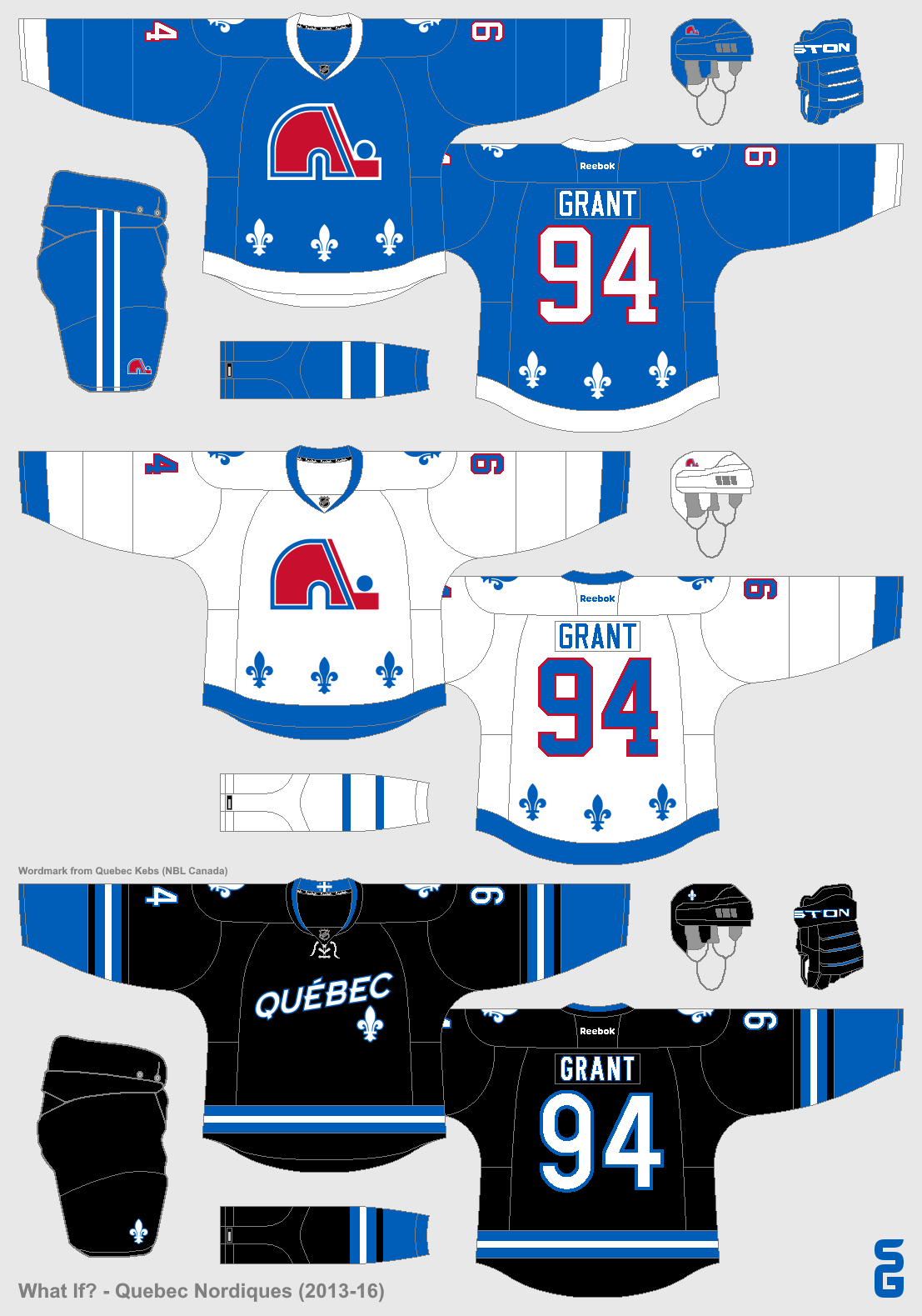
2013-16
A black third jersey was added that didn't feature the Nordiques classic Igloo logo at all. The inside of the collar used a Quebec flag as a hanger effect, and the proportion of the stripes were also taken from the Quebec flag (3-2-3).
2016-17
The Nordiques faced off against the Winnipeg Jets in the 2016 Heritage Classic, wearing a baby-blue jersey based off of their
inaugural WHA look. The jersey would be worn several more times throughout the season, replacing the black third jersey which had been retired after three seasons.
Adidas Adizero Era
2017-19
Only minor changes were made to the Nordiques jerseys during the league-wide switch to Adidas, including ditching the outlines on the numbers, and using a different sock stripe. Also three fleur-de-lis were added to the inside of the collar as a hanger effect.
2019-22
A "stealth" third jersey, with no white at all, was added to the rotation. The third shade of blue (baby-blue) comes from their 2016 Heritage Classic jersey.
2019-20 Throwback
To celebrate the 100th anniversary of the lone NHL season of the
Quebec Athletics (aka the Bulldogs), the Nordiques wore throwbacks of their jerseys for a handful of games throughout the season.
2021 Reverse Retro
For the NHL's Reverse Retro program, the Nordiques brought back their "Wolf" design from the 90's, this time with teal as the base colour. In stark contrast to 25 years prior, fans welcomed these jerseys back with open arms. Also this season, Videotron became the team's helmet sponsor.
2022-Future
Due to declining jersey sales, the Nordiques decide to ditch their classic set. The "stealth" jersey becomes the new home jersey, and a matching white jersey is added which features ghosted fleur-de-lis (white on a white background). Also, the Nordiques announce Desjardins Group as their official jersey sponsor (Videotron remains the team's helmet sponsor).
Thanks for checking this out! I had a blast making these concepts, it was a lot of fun imagining what could have been if the Nordiques had stuck around (if you're looking for ideas for concepts, I highly recommend trying a fictional timeline like this).
See you later!


.png)
.png)


.png)

.png)
.png)

.png)
.png)
.png)
.png)
.png)


.png)


.png)
.png)


.png)
.png)
